Did you ever sit down to edit something and think… “What the heck am I in the mood to listen to?” Well, you’ve come to the right blog post. I don’t know about you, but I’m the kind of human who is constantly soundtracking his life. I have playlists for everything and pretty much always have music on. If I were to ever go anywhere without my headphones I’m not sure I could function. When it comes to Photoshopping I’m all over the map - you know, the map of noise things to put in your ears. Anyway, below are some of the noise things I personally enjoy most while I Photoshop.

For all those who are reading the title of this article and thinking to themselves, “What the crap is Cyberpunk?” … Well, according to the dictionary it is, “A genre of science fiction set in a lawless subculture of an oppressive society dominated by computer technology.” Just think “Blade Runner” and you’ve got the gist of it. As much as I love (and will obviously always love) to create stereotypical fantasy art, I’ve recently been super inspired to create artwork that leans on Cyberpunk themes. What’s not to love about neon lights, shiny leather, sunglasses at night, glowing technology, and in-your-face vibrant colors popping out of the dark moodiness of a dystopian futuristic city!?

I’ve been working on a couple really cool collaborations lately and this newest image, well, it’s one of those collaborations. This one was a bit different for me though - You see, normally when I collaborate with another artist I prefer to actually shoot the images with them. At the very least we combine images we shot separately to create one final piece. For this picture though, none of the pictures are mine. Here’s how it went down …

Have you ever had a client shoot where they really wanted a picture done a certain way, and you just knew that it would look better if you did it a bit differently? Or like, entirely differently? Well, the trouble with clients is that they’re the ones signing the check at the end of the day, and if they are not pleased with what you did … you might just not get that John Hancock. Obviously, as we all know, the customer is always right … even when they are wrong. SO, I’ve learned a fancy trick (it’s not fancy) where I shoot until the client is happy, (hooray happy client!) and they feel they have the images they want, and THEN if I have the time, I’ll do it my way.

When it comes to composites I think people (and as you know if you read this post, I too) sometimes forget that a composite image doesn’t alway have to be cutting out a subject and putting them on a background. One fun and interesting way to spice up your composite game is to include elements of the actual surroundings along with the subject. As in only replacing part of the background in order to put the subject and part of their environment somewhere totally different rather than cutting out JUST a model. This works best when you aren’t in the studio and can shoot somewhere super cool, like IDK a rusty old railroad bridge perhaps?

It’s funny to me how the start of a new year is like a clean slate … not that my slate was particularly dirty …. 2018 was just fine. However, no matter what happened last year, the start of another year always feels exciting. “This is the year I’m really going to do it!” Whatever it is. January 1st is just another day; nothing is actually different other than the last number of the date that we write incorrectly for a couple of months. (Do eraser sales go up in January? Jk it’s 2019 who is writing things in pencil?) But hey, if we all get a solid boost of let’s-get-out-there-and-kick-ass-ness for no reason other than the fact that we watched a sparkly sphere lower on the top of a building while we collectively count backwards (like some kind of weird ritual happening all over at once if you think about it … just don’t think about it) … well that’s fine by me!

I’m a competitive person. I love contests. I love a challenge. So even though it’s wasn’t a contest, and no one “wins,” when it came to art class I wanted to push myself and try my very hardest. (I want to be the best, like no one ever was….) My BFF Veronica (who is a stupidly talented artist) and I were (and probably still are) my art teacher’s favorites. NBD. I’m getting side tracked, sorry to high-school-art-class-royalty-brag all up in your faces or whatever. What I’m getting at is that when I’m faced with a challenge, especially with a contest that has rules, guidelines, subject matter, and most importantly a time constraint, it always makes me create some of my best work. That was no exception when it came to the Dungeons & Dragons “Terror of Undermountain” monster creation contest that Adobe just hosted.

Sometimes even I forget exactly what the term “composite” actually means. Technically it’s just combining more than one image to make a single final picture, like when you do a family picture and Grandpa is looking confusedly off into space like he doesn’t know how to be in a picture. (He always does that. GRANDPA LOOK HERE!!) So, you take the one image where he is mostly looking at the camera and kinda smiling and replace his head in the other photo where everyone else looks good … That’s a composite. (Not to throw shade at my Grandpa, he is an 80-year old champion, whom I love.) I’m so used to shooting a subject in the studio and then clipping them off of their background to place them somewhere else, that in my brain, that process has taken the place of what it (my brain) believes is a composite. For the above image (and also below, I guess), I created the finished composited piece of art without ever cutting out the subject.

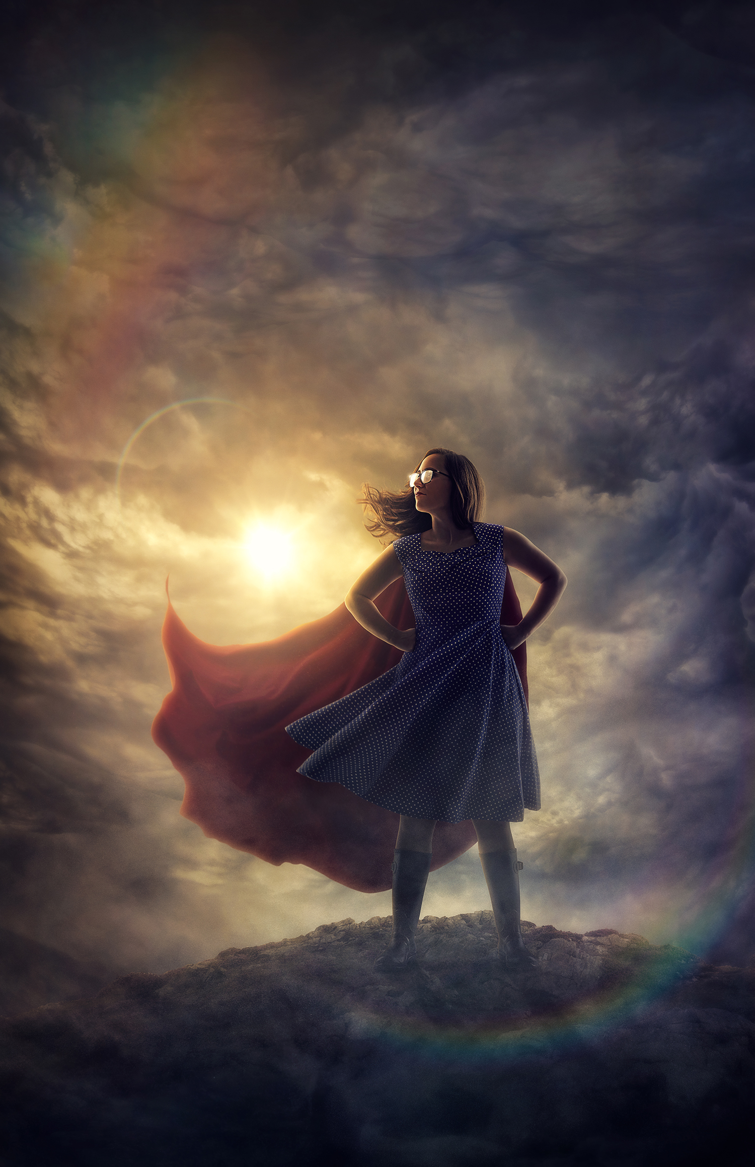
As I sat at my computer (almost exactly a year later) staring at the photos trying to decide which one to edit, and what exactly to do with it, I got inspired by a certain capture. There was just something about Loren’s pose/face/posture/movement that looked like she was leaving the cave on a hunt. When I showed the work-in-progress to Loren she said she did seem to be “channeling her inner velociraptor.” Then I thought to myself, “hey self, why would there be a lovely lady in a pretty pink dress leaving a cave like a glorious velociraptor?” My creative gears started to churn and I cranked out an idea that I’m quite pleased with ….

I had recently picked up these nifty blue shades for 3 dollars (because I have a nose for clearance sales). I brought those and a blue sweater I have and decided to base my image around them. Normally while creating a wizard image one might not think to include sunglasses, but I was imagining him summoning some crazy bright blue magic light and he would need these spacial glasses to be able to see by the light without his eyeballs melting out of his face ... or something. My brain is weird. So anyway, here is how I created said magical blue eye melting orb...

About a zillion years ago (ok, it was February ... so same thing basically), I created a self portrait image ( ... ok, so it was several images) using ONLY lights from around my house. I wanted an exercise in something outside my current comfort zone and to challenge myself to get back to my photography roots. I did a whole post about it. I encourage you to go and enjoy that blog post before reading this one, but it's not required... or is it!? No, it's not, but do it anyway. I then challenged any takers who might have felt like taking to also create a self portrait image without any traditional photography lights

As an artist who shoots mostly composites, more often than not I'm going to be cutting out my subject and placing them in a different scene. A lot of the time I only have a rough idea of what kind of a background I'll be using, so I just shoot my subject as best as I can and figure out the backdrop later. Sometimes I have no idea what I'm going to do with my model, but a wise and incredibly good-looking man once said, "You don't always need a plan." ... HOWEVER, if I do a shoot knowing full well what my background looks like before I even pick up my camera, it makes everything a million times easier.

As an artist who primarily creates composite images, I find that one of my biggest challenges is hair - masking hair, to be exact. It can be nearly impossible to get all of those little individual hairs cut off their background so I can place my subject somewhere magical. NEARLY impossible ... Ok so it's actually not THAT hard, but there is one major tip that will make your life about a 1000 times easier. Shoot on the right background.

These days I primarily shoot in a HUGE studio with more amazing flash equipment than I could ever hope to afford myself ... ok, so I could HOPE to afford them, but at this point in my career let's just say I'm a very lucky boy to have all these fun photography toys at my disposal.I was thinking about how I've come so far from those long lost days of household lighting experiments. Every once in a while I like to shake things up and challenge myself, so why not go back to my roots and try to do a self portrait image using nothing but lights from my house!?!?

Soooo yeah, remember that other time I created a baby dragon in Photoshop? Well, in the immortal words of Britney ... Oops, I did it again. (Yeah I went there.) I was thinking about how I'd love to grow my audience (weird, right?) and get more recognition for my work ... or whatever, and one of the best things you can do to stand out of the crowd is to figure out something you can do that not everyone else can, and you know, do it! Last time that I used my wizard-y-Photoshop-powers to craft a dragon, the internet sorta lost its mind. Ok, so not the whole internet, but those who saw it seemed to be pretty into it and that blog post is still one of my most popular. I say, give the people what they want! Also, I would be lying to your face if I said I didn't love anything and everything having to do with dragons. So without further ado, I grant to you kind readers, 4 tips for creating a dragon in Photoshop!

As photographers (or artists in general), we're all searching for that elusive "style" phenomenon everyone talks about. We want to have our own "style" with hopes that one day people might look upon our work and say things like, "hey, I like your style...." There is no formula for finding a style; you basically just have to create, A LOT. Keep shooting the things you love to shoot and editing the way you love to edit, try different things, fail, try them again, and your style will sort of naturally grow into a thing. One day it will just be there like a stray dog that falls perfectly into your life like it was always there. You won't even realize it happened. (Disclaimer: You might, however, notice a new dog in your house ... just an observation.) You can't force it (I don't believe anyone who goes out looking for a new stray dog finds one), just work and the style will come. (Disclaimer 2: Maybe this analogy is crap? ... because unlike a "style," if you want a dog, just go to the shelter and get one.)

I'm charging into 2018 with a fire under my ass that hurts so good! There are already some really exciting opportunities on the the horizon that I can't even believe are seriously going to happen, but before I move forward I need to do some important reflecting (get it, reflecting? Cuz of the mirror photo ... ) and hopefully bestow upon you a lesson I learned that I definitely shouldn't have needed to learn. Meaning it should just obviously be taken seriously and tended to all the time, not merely after something terrible happens. Friends, I'd like to talk to you about ... backing up your files.

Layers on layers on layers on layers .... I've been working on this image for far too long, just long enough, but also not nearly as much as I'd like to? Needless to say, I put a lot of time and love into this edit and really really enjoyed the process of adding in the countless tiny details. TBH it took some major restraint on my part to finally call it "done" and move onto the next project. Seriously though, people - I feel like I could continue to zoom way in and refine/add more details for-EVAH. Which is exactly what I'd like to talk about today: taking your time and adding more details!

Did you ever finish an image (or think an image was finished anyway) and it just didn't seem to sit right? You look at it and it's almost as if your eye can't decide where to go? Well, if you, the almighty creator, are having this issue, then odds are anyone looking at said image is going to suffer from this problem as well. One of the most important things you can do to an image is to "tidy up." Aka attack your image with the patch tool, clone stamp, and whatever means necessary to get rid of anything that might beckon the attention away from your subject.

First, let's get the tedious part of the process out of the way. For the most part, I hand paint each little particle so they fall exactly where I want them to go. I use Photoshop's default brush with zero percent hardness and click around constantly tapping the bracket buttons (right next to the "P" key - they are quick commands for enlarging and shrinking your brush size). I try to make sure there's a somewhat natural flow to them and not to have all of them too perfectly spaced out. There is definitely an art to particle placement.

Quick Mask Mode. Guys it's pretty awesome. Does anyone ever use this? If you're sitting there like "IDK, what's a Quick Mask," the answer is, "No, it's not when you use a layer mask as fast as you can." Quick Mask is a tool in Photoshop that lets you more precisely edit your selections. You can activate it by pressing the "Q" key or clicking the little rectangle-with-a-dotted-line-circle-in-it at the bottom of your tools palette. Some of you may already know what it is but hardly ever think to use it for anything. Well I'm here to let you know that it can be incredibly handy if you use it correctly.

If you're in the gym and trying to lift something heavy, odds are you need a spotter. Even if you fancy yourself to be a big strong macho man (or woman). You may think you can just do it yourself (and maybe you can), but wouldn't it be safer to have an extra set of hands to yank that weight off your chest if you try to bite off more than you can chew? Perhaps you and your silly pride can struggle through it, but odds are you're going to have bad form; the sloppy reps just aren't going to deliver the results you were hoping for. Creating a piece of artwork is no different. Sure, you can do it all by yourself and get something done, but it's always a good idea to find an artwork spotter to have your back.

I can't tell you how many times I get comments like "Wow this is so cool; it almost looks like a painting!" Not that I'm complaining about that whatsoever; I take it as a compliment. It's one of my goals when creating a work of art - to make something that isn't quite a photo, but isn't quite a painting. "Yes, but how do you make it look like that!?" Well, since you asked I guess I could explain some of the process. Obviously a LOT goes into making my images look the way they do. Fancy studio lighting and a hefty amount of digital painting play large roles, but one technique that really pushes my work towards that sort of hyper-real-digital-illustration-y-type-look is the use of the "Shadows/Highlights" adjustment.

A super easy way to add motion to an edit is to apply a motion blur filter. I know it's so obvious it seems silly, but there is definitely more to it than just slapping a filter on top of your image. First of all you have to decide what is in motion and what direction it's going in. For "The Retreat" I knew that he (the dragon ... well subsequently Niall too, I guess) would be charging towards the left side of the frame, so the angle of my motion blur was easy enough to figure out. I was attempting to emulate the look you get when you pan the camera following along with a moving subject. For example, if you were to try to take a picture of a passing motorcycle, you could track it in the center of your frame, then when you snap the photo the motorcycle would be more or less crisp and the background would have the motion blur.

Being a full-time huge fan/buddy of the guys over at the RAWexchange store, I often get asked to check out their new material. (Just to clear the air, no one is paying me to say any of this. I just love them and everything they put out ... like, for real. I DO get a cut of the sales if you happen to purchase something through one of my links, but that is besides the point. The RAWexchange Store really does just have top notch stuff that I ACTUALLY use in basically every image ... ok moving on.) Well friends, let me tell you that their newest endeavor to start selling in-depth tutorials is one of their best ideas yet. Stefan Kohler created a "Colors & Photoshop" tutorial that is two and a half hours jam-packed with everything you could ever hope to know about colors and how/why they work the way they do in Photoshop.

One of the techniques I frequently use when shooting on location (by frequently I mean pretty much every time) is to expand my frame. I believe that many of you know of this fancy maneuver and are probably already doing it like total pixel gathering pros. (Well done, friends.) However, we are all at different levels on our journey towards creative greatness, so for those of you who haven't tested out this handy trick yet - allow me to elaborate. ALLOW ME!! K thanks. (And for those that do know this technique, kindly stick around for some tips and tricks that will hopefully take your expanding game to the next level.)

I had the pleasure of shooting with Amy Wilder again! It is always such a joy to shoot with someone who is so on top of their shit. This girl knows how to work it. Normally when I do a shoot I'm trying to get as much "right" in one frame as possible. Aka the face, pose, hair, dress, whatever other magical elements that I'm capturing in camera, all to my liking in one shot. Very often I can get pretty close and only end up adding a bit of extra dress here or a hair flip there. Although apparently there are those other times when your model gives you too many perfect pictures and you just cannot decide what to use ... so you go nuts and just combine many shots ... so. many.

Sooooooo I made some armor. Not tangible armor, though (maybe one day). You see, the site ShiftArt.com does a monthly photo contest where they give you a selection of stock images to edit however you choose, as long you use a certain amount of them. This month the prize was a 13-inch Wacom Cintiq. So yeah, um duh, of course I was going to enter. I came in second place, but I still feel like I won because I ended up putting together this badass image that I never would have made otherwise. :)

Being the self-appointed-official-fancy-pants-Photoshop-wizard that I am means one of my favorite pastimes is to take a mostly simple image and add a bunch of elements to make it SPECTACULAR. (Well, hopefully spectacular anyway.) Here, my friends, is basically how that all went down in ten steps ...
I often notice in composites that the subject can end up looking a bit cardboard-cut-out-ish. There are many different factors that lead to this appearance, but one of the main culprits is having the outer edge of the subject be too sharp. Humans are rounded. The edge of an arm for example is rolling away gradually. Therefore, more often than not (depending on what focal length you’re emulating), that edge is going to drop slightly out of focus. If it is too sharp all the way to the edge then it’s liable to look more like it’s all the same distance form the camera, aka completely flat across.