
Be real, did you decide to read this because I put “secret” in the title? Did you!? Am I working the internet system machine!? … Well anyway, it’s a scam. These tips are not secrets, because I’m about to tell them to you. So sit back, relax, and get ready to soak up three techniques I almost always use to add the finishing touches to my images.
TIP ONE - Soften Your Edges
I often notice in composites that the subject can end up looking a bit cardboard-cut-out-ish. There are many different factors that lead to this appearance, but one of the main culprits is having the outer edge of the subject be too sharp. Humans are rounded. The edge of an arm for example is rolling away gradually. Therefore, more often than not (depending on what focal length you’re emulating), that edge is going to drop slightly out of focus. If it is too sharp all the way to the edge then it’s liable to look more like it’s all the same distance form the camera, aka completely flat across.

So, here is how I handle this: As mentioned in the title, this is a “finishing” move, so I do it very last. First I do a stamp visible. Then I blur the new layer as a whole. You can use any blur filter for this, but I prefer “Lens Blur” because I like the quality it creates and you can add noise right in the filter. After that I add a layer mask and inverse it (fill it with black) so the blurred layer visually disappears. Next, with a soft brush at a low opacity, I gradually paint in the blur on the layer mask as needed on edges and areas I want to soften.
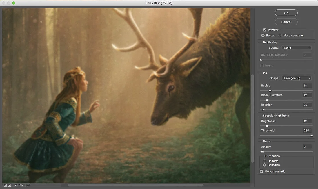
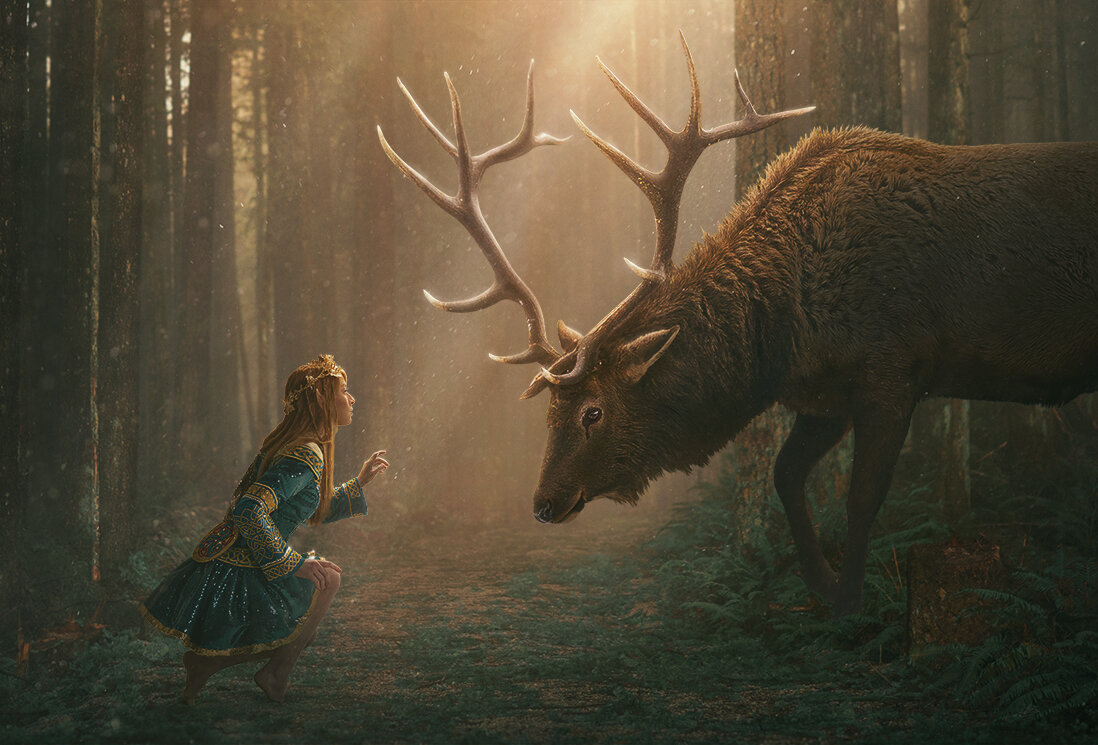
You have to be careful not to overdo the blur or you end up with weird, sort of muddy glowing edges wherever you paint it in (especially if you don’t add noise), but when used tastefully it can be amazing for blending your subject more realistically into the scene. This tip obviously lends itself more towards composited images with a somewhat blurred background, but it can be applied to any picture. Use the same technique to slightly fuzz out and blend areas of your image where you don’t want your audience to look. Basically it’s the opposite of sharpening the areas of interest; you’re blurring the areas of .... non-interest. Below you can see just the blur layer with the areas I masked back in.

TIP TWO - “Difference” Blending Mode
One of my favorite parts of editing an image (and probably many of yours as well, I’d imagine) is messing around with the colors. I’m sure you’ve all dabbled in curves, selective color, color balance, and/or hue saturation to name a few, but I’d wager not a ton of you have done this weird little trick I’m about explain.

Here’s what you’re going to do … Make a new layer and fill it with a color. It can be any color (and since this is Photoshop you can change it later as much as you’d like). Try starting with a color from the center of the color picker (as seen below) - so it’s not overly saturated or overly bright or dark. For this image I used a teal/green tone.

Set this new color layer’s blending mode to “Difference.” I’d attempt to explain what this mode does, but I feel like even if I tried to say it I’d be like, “What did I even just say?” And you’d be like, “What did he even just say?” So basically, just know that it works in a roundabout way like a film negative ... sorta kinda? … Anyway, when you set your layer to “Difference,” it will color grade your image in a drastic way. The darker the pixels in your image are, the more strongly it will be the color you picked (note the Elk’s leg above), while the lighter the pixels are, the more it will transition to your color’s complimentary color (aka opposite on the color wheel).

Alter the opacity and fill of that layer until you deem it pleasing. I usually end up erring on the side of subtlety and have an opacity of around 5% and a fill of 100%. The opacity lowers the intensity of the effect overall, and the fill changes how (and sort of where?) the pixels are effected. The lower the fill is, the less of the highlights and shadows are effected, so it gradually introduces white back in, starting with your lightest pixels. Just play around with it, you’ll see what I mean. Also, you can pop open a hue/saturation adjustment layer and clipping mask it down onto your color layer, then experiment with the hue, saturation, and lightness sliders to try out different looks.
TIP THREE - Camera Raw
I’m not sure if this is common knowledge, but to use the “Camera Raw Filter” you don’t technically have to be opening a raw file. For the longest time I only ever used it to develop a raw capture at the very beginning of a project. I eventually picked up this finishing trick from my cousin James Sterling (whom I religiously send my “finished” images to for his thoughts and feedback) - Now I am passing it on to all of you. There isn’t a whole lot to say about this tip other than … do it.
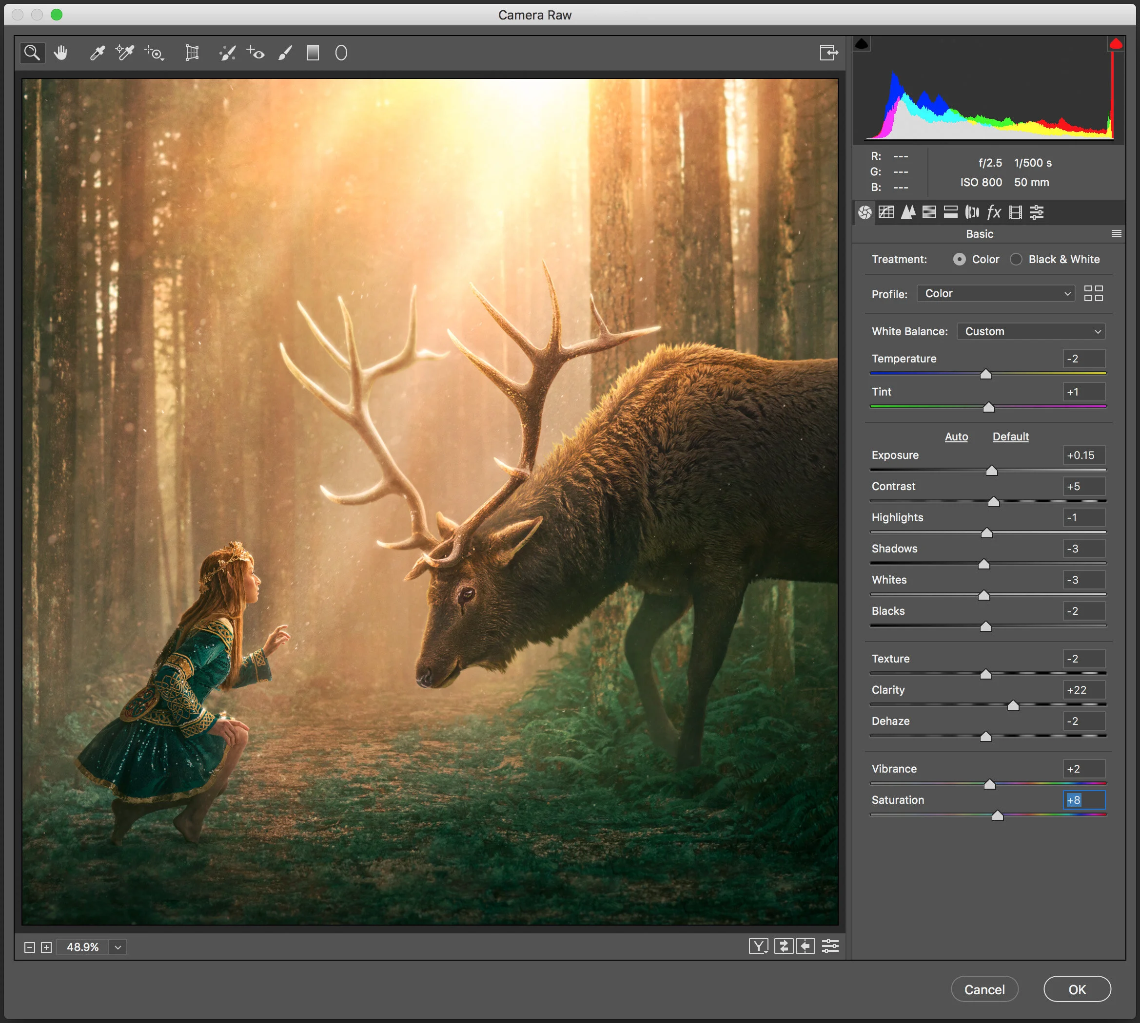
Once you are happy with your image, you’ve softened your cardboard edges and color graded with your fancy new difference blending mode technique, do a stamp visible and launch the Camera Raw Filter. (Conveniently located near the top of the “Filter” drop down menu.) Now just mess around with all the sliders! Just remember it doesn’t need to be drastic changes, but it can be that little extra punch right at the end that ties the whole look together. For most of my images I end up liking a bit of clarity, maybe some contrast, and possibly a bit of tweaking to the shadows and highlights, but you do you.


So there you have it, three tips and tricks for adding a little something-something to your image right before the finish line. I hope you found any or all of these to be helpful! Remember, if you’d like more help, feel free to pop on over to my store and book yourself a mentoring session!! ;)
